Columbus Assicurazioni
Summary
Redesigned Columbus Assicurazioni's travel insurance quote flow, replacing a single long-scroll form with a guided multi-step experience — driven by Hotjar heatmaps, session recordings, user interviews, and Google Analytics funnel data.
Role
Client
Columbus Assicurazioni
Year
2024

0%
Conversion increase, validated via live A/B test
5+
Core Workflow Stages Compeleted.
31.3%
Mobile drop-off point improved

Pain Point 2
Low Engagement Below the Fold
Scroll-map analysis showed only 75% of users scrolling to the halfway point and just 50% reaching the bottom of the page — meaning half of all plan comparison content went unseen before users dropped off.


[002]
Solutions
01
5 steps, replacing 1 long form
Multi-Step Guided Flow
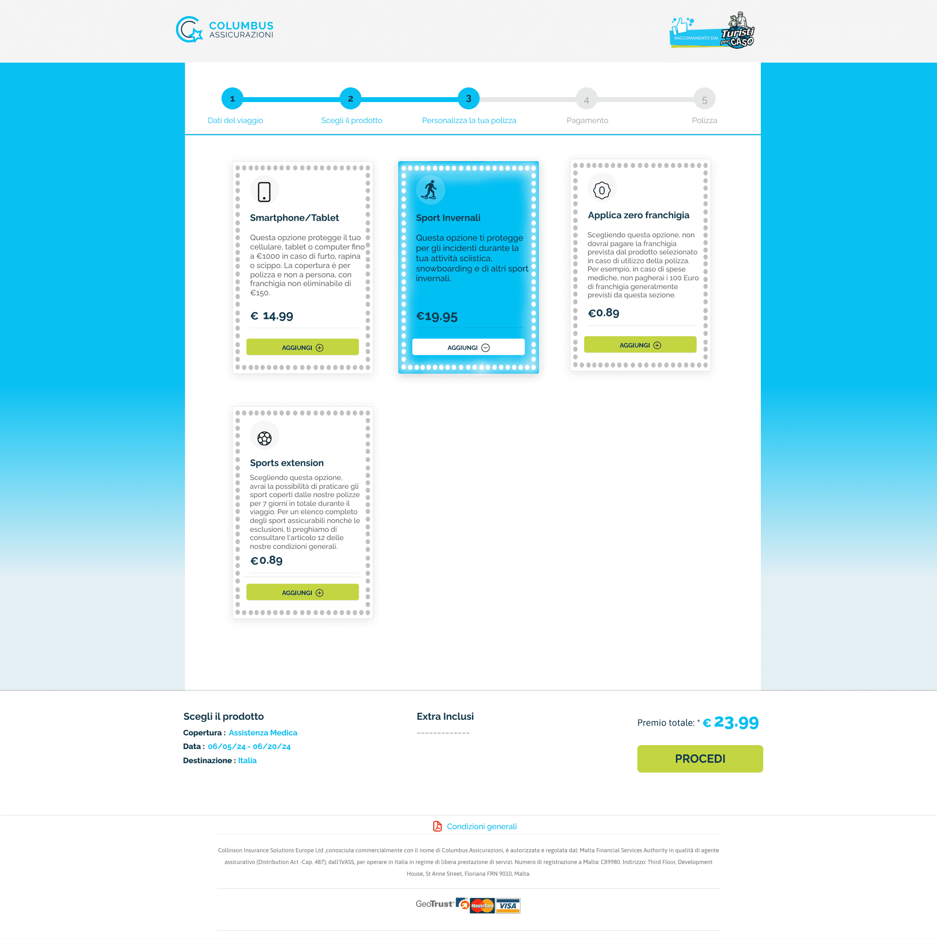
Replaced the single long-scroll form with a 5-step guided flow — Trip Details → Choose Product → Personalize → Payment → Policy — so users only see what's relevant at each stage, directly addressing the below-the-fold drop-off found in the scroll-map data.

5-step progress flow — trip details → product → personalize → payment → policy


02
Targets the 26–31% drop-off step
Simplified Product Comparison
Redesigned the highest-drop-off step into a clear side-by-side comparison of the four policy tiers (A/B/C/AN), with the recommended plan visually highlighted and full coverage details available without leaving the step.
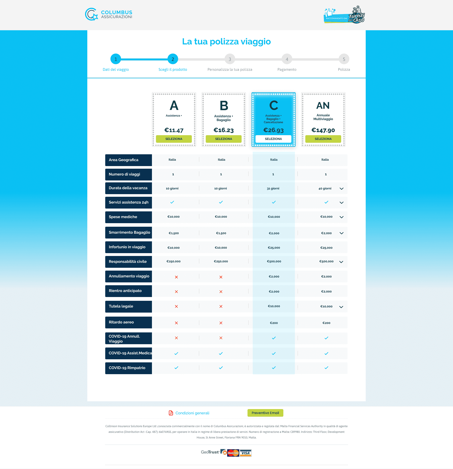
product comparison — 4 policy tiers, most-popular plan highlighted




[003]
Design Process
Design Process
From research to refined solution
Unified data ingestion, transformation, and synthetic generation. Handle structured and unstructured data with automatic schema detection and quality validation.

Combined user interviews with Hotjar heatmaps, scroll maps, click maps, and session recordings, plus Google Analytics funnel data, to understand exactly where and why users were dropping off.
Problem Framing
Restructured the single long-scroll form into a guided multi-step wizard, sequencing decisions instead of presenting them all at once.

Flow Redesign
Designed the layered chat-first / direct-manipulation model to serve both novice and advanced users in one system.
Visual & Interaction Design
Designed the step-by-step UI, the product comparison layout, and the persistent CTA pattern, with a mobile-first approach given the higher mobile drop-off rate.

A/B Testing & Validation
Ran the redesigned flow against the original in a live A/B test with split traffic, measuring conversion lift directly rather than relying on pre/post comparison alone.

[004]
Results & Impact
5
Mobile drop-off point improved
31.3%
Mobile drop-off point improved
User interviews, Hotjar heatmaps, scroll maps, and session recordings revealed a major point of friction at Step 3 — product selection. At this stage, 26.1% of desktop users and 31.3% of mobile users abandoned the flow, while scroll data showed that only around half of users reached the full plan comparison.
In response, the experience was redesigned from a dense, single-page form into a guided multi-step journey, with clearer decision points, simplified product comparison, and a persistent call to action.
When tested against the original experience using split traffic, the redesigned flow delivered a 40% increase in conversion.